 |
||||
|
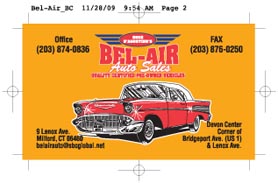
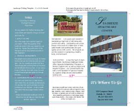
Digital File Furnished for Copy Application Files If you are sending us an application file, let us know the name and version of the application to see if we can work with it. Chances are we can. To avoid additional charges, please just send a pdf file. Spot Color vs. 4 color; Many times a project is quoted as two colors and the file furnished is 4 color, even though visually it appears as 2 color. If we are printing 2 color, the file has to be created as 2 color. Some applications use rgb pallets for colored type and clip art images and cannot just be converted to spot color. Sometimes the image or type has to be recreated in spot color which may incur additional charges. Bleeds and Crops Bleeds are a common problem that can be easily remedied. A bleed is when the ink comes right to the edge of the paper. Printers really need the ink to extend beyond the edge of the paper at least 1/8”. We will print your project on oversize paper and then trim off the excess so that the ink comes right to the edge. We also need crop marks showing us exactly where the trim is. 1 up or multiple up Some think that printers only print on letter size 8 ½ x 11. This is a common misconception. Printers use many sizes to print on. Many times, our goal is to get as many up on a sheet as possible. We do use letter, legal and tabloid size stocks, but also many other sizes. If the finished size of your project is 5 ½ x 8 ½, just make it 5 ½ x 8 ½, not 2 up on 8 ½ x 11. Many applications do not have a step and repeat feature and it’s obvious that the space or tab key was used to space out the type, which doesn’t do a very accurate job. Type it out as 1 up and leave it that way. Microsoft applications are widely used by many businesses. Please note that using Word, Excel, PowerPoint, and Works can create real challenges with fonts, images, bleeds, etc. We accept these files and will always create a pdf from the file for approval before we proceed with the printing. Microsoft Publisher is a much better choice in creating your application, but it too has issues especially with spot color. Folding If you are doing the layout for a folded piece, the panels must be sized correctly. An 11 x 8 ½, tri-fold brochure is the most common. The design should include 2 panels of the same size and one panel slightly smaller. 1/10” is a good amount to shorten the smaller inside panel. The two equal size panels should be 3.7” which leaves 3.6” for the smaller panel. The inside panel must be at least 1/10” smaller to provide a clean look and prevent most dog-eared corners. Also try to use a minimum of ¼” margin for live type and elements within each panel. To minimize cracking on projects with heavy ink coverage on text weight stocks, consider having the folds scored before folding. Always score cover stocks. Avoid using lines or rules directly in or on the folds-they often produce an unplanned and unattractive look. Avoid using thin frames or borders around panels or entire pages. Thin frames may not trim out evenly and could look more like a mistake than a planned element. Additionally, frames around individual panels will tend to break up the flow of a good design. Keep in mind that printing is a custom manufacturing process. Your printed piece will benefit greatly from a little planning and forethought in the early stages of design. |
||||